

Have you ever wondered how to build a clock? Have you ever wanted to build your own clock but didn't because it was hard? Well, today I'm going to show you how to build one and you know what? It's very simple!
It will look something like this (But make sure you do add some custom CSS) :
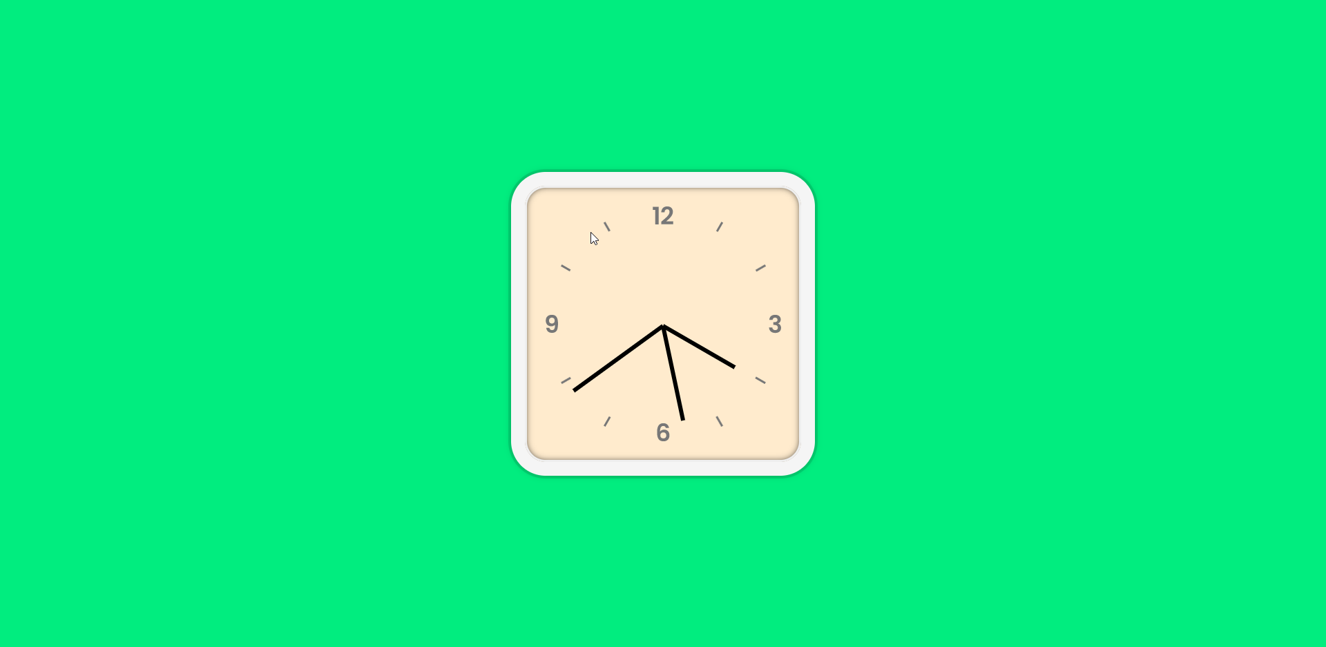
Here's the live demo and final code.
Part 1: Prerequisites
You should have a beginner understanding of:
- HTML
- CSS
- JavaScript
Part 2: Setup
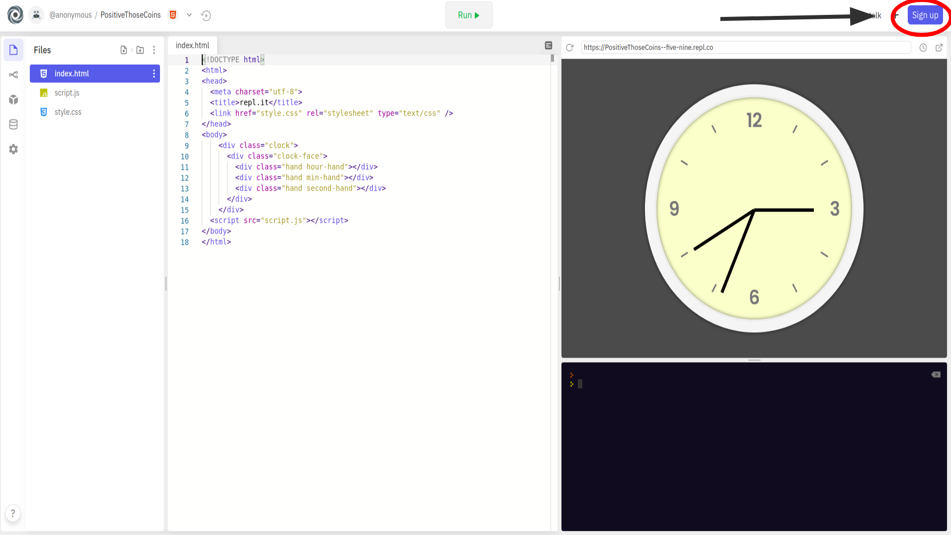
Setting up your code environment on Repl.it
Repl.it is an online code editor where you can build your clock. You don't have to use Repl.it but I suggest you do as it sets everything up for you and you don't require any installations.
To get started, go to https://repl.it/languages/html. Your coding environment will spin up in just a few seconds!
You should see something like the following:
Part 3: Inspecting The Default Files

1) The HTML file
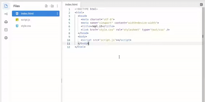
Let us first take a look at the HTML file (index.html).
At line 1 we have <!DOCTYPE html> This declares that this file is an HTML file. If we take a look in the <html> tag, we will find a <body> tag. Here's where we will write the code. Make sure that all the code you write is included between the opening and closing body tags. (<body></body>).
Make sure to remove line 5 (<meta name="viewport" content="width=device-width">) which may cause some weird responsiveness issues for our workshop.
2) The CSS file
This is the style.css file in your directory. Whatever styles we give to our website is written in this file. If you take a look in the <head> tag in your HTML, you will find a line of code (<link href="style.css" rel="stylesheet" type="text/css" />). This means that your HTML file is properly linked to your CSS file!
3) The JavaScript file
This is the script.js file in your directory. It's empty for now, but we will fill it eventually through the workshop! The code written here will be responsible for the functioning of our clock.
If you take a look in the <body> tag, you'll find:
<script src="script.js"></script>
This means that your HTML file is linked to your JavaScript.
Part 4: Building the Clock
1) HTML
Let us start building our clock! First, we'll write the HTML code required.
Inside of our <body> tag, add a <div> tag with a class clock. Add another <div> tag inside of your existing <div> and give it a class of clock-face.
Now add 3 more <div> tags nested inside of the clock-face div. Give a class of hand hour-hand, hand min-hand, hand second-hand to each of the 3 new <div> tags respectively.
Note: Make sure the <script> tag, which is in your body, is below the <div> tags, or else it will throw you errors.
This is what your code should look like so far:
<!DOCTYPE html>
<html>
  <head>
    <meta charset="utf-8" />
    <title>repl.it</title>
    <link href="style.css" rel="stylesheet" type="text/css" />
  </head>
  <body>
    <div class="clock">
      <div class="clock-face">
        <div class="hand hour-hand"></div>
        <div class="hand min-hand"></div>
        <div class="hand second-hand"></div>
      </div>
    </div>
    <script src="script.js"></script>
  </body>
</html>
And that's it! We have completed writing our HTML.
2) CSS
After we have done writing the HTML, you'll notice that when we click RUN, you just see a white screen. Let's now add some styles to our elements!
Go to style.css in your repl.it directory. Let's start by adding some styles to our body! uhh... I meant <body>! Add the following code to your CSS:
body {
  background: #01ed7f;
  margin: 0;
  padding: 0;
  display: flex;
  align-items: center;
  justify-content: center;
  min-height: 100vh;
}
Explanation: 3 main steps in writing CSS:
- Select the element / class / id on which you want to apply your styles.
- Open curly brackets
{}. - Start adding your styles inside the curly brackets!
We start by giving our website a soothing green color. Go ahead and try changing it to the color of your own choice!
Then we removed the default margin and padding from all the elements in our website (some elements have a default value for their margin and padding such as 2.4, 3, etc). We changed the default display display: block to display: flex.
A very good reason for this is because flex enables you to align your items perfectly to the center! And that's what we have done in the next two lines. The align-items property aligns all your children elements to center, but horizontally. The justify-content property aligns all your children elements to center, but vertically.
Next, we have the min-height property which sets a minimum height of 100vh (viewport height) to your <body>. The min-height property works together with the align-items property and helps the children to align properly at the center.
Learn more about viewport heights.
Next, we'll need to add some styles to our clock! Following the 3 main steps given above, let's accomplish this task!
- Select the class designated to the clock div.
- Open curly brackets to write the stylings.
- Add the following styles to this class.
.clock {
  width: 25rem;
  height: 25rem;
  border: 20px solid whitesmoke;
  border-radius: 50px;
  background: blanchedalmond;
  background-image: url(https://bit.ly/2RcERUw);
  background-size: cover;
  box-shadow: 0 0 0 4px rgba(0, 0, 0, 0.1), inset 0 0 0 3px #efefef,
    inset 0 0 10px black, 0 0 10px rgba(0, 0, 0, 0.2);
}
Explanation: We gave the width and height to our clock. Next, we gave it a border and the radius for the border. Next, is the background color for that clock (if you don't like it, consider changing it or even removing it).
Similarly, there's this line:
background-image: url(https://bit.ly/2RcERUw);
That image is the face of the clock. we need to add background-size: cover; property, in order to show our image properly on the website screen.
Also, we have added some shadows to the element. We gave multiple shadows so as to get a cool effect on our clock. Also, the inset property changes the shadow from an outer shadow (outset) to an inner shadow.
Now let's test our code! Click on the RUN button and Voila! Here's the basic background for our clock! (if it doesn't look like this, make sure you crosscheck every single line of code).
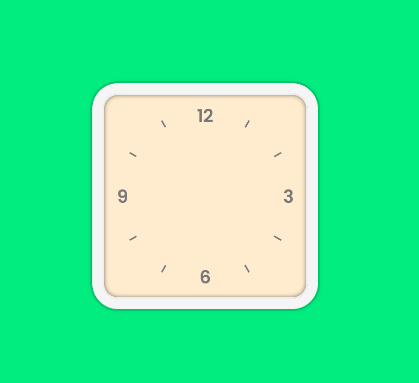
Next, give position: relative; , width: 100%; & height: 100% to the class .clock-face.
(Try to do it on your own by following the 3 main steps of writing CSS).
Your CSS code so far:
body {
  background: #01ed7f;
  margin: 0;
  padding: 0;
  display: flex;
  align-items: center;
  justify-content: center;
  min-height: 100vh;
}

.clock {
  width: 25rem;
  height: 25rem;
  border: 20px solid whitesmoke;
  border-radius: 50px;
  background: blanchedalmond;
  background-image: url(https://bit.ly/2RcERUw);
  background-size: cover;
  box-shadow: 0 0 0 4px rgba(0, 0, 0, 0.1), inset 0 0 0 3px #efefef,
    inset 0 0 10px black, 0 0 10px rgba(0, 0, 0, 0.2);
}

.clock-face {
  position: relative;
  width: 100%;
  height: 100%;
}
Similarly, add more styles to your CSS code:
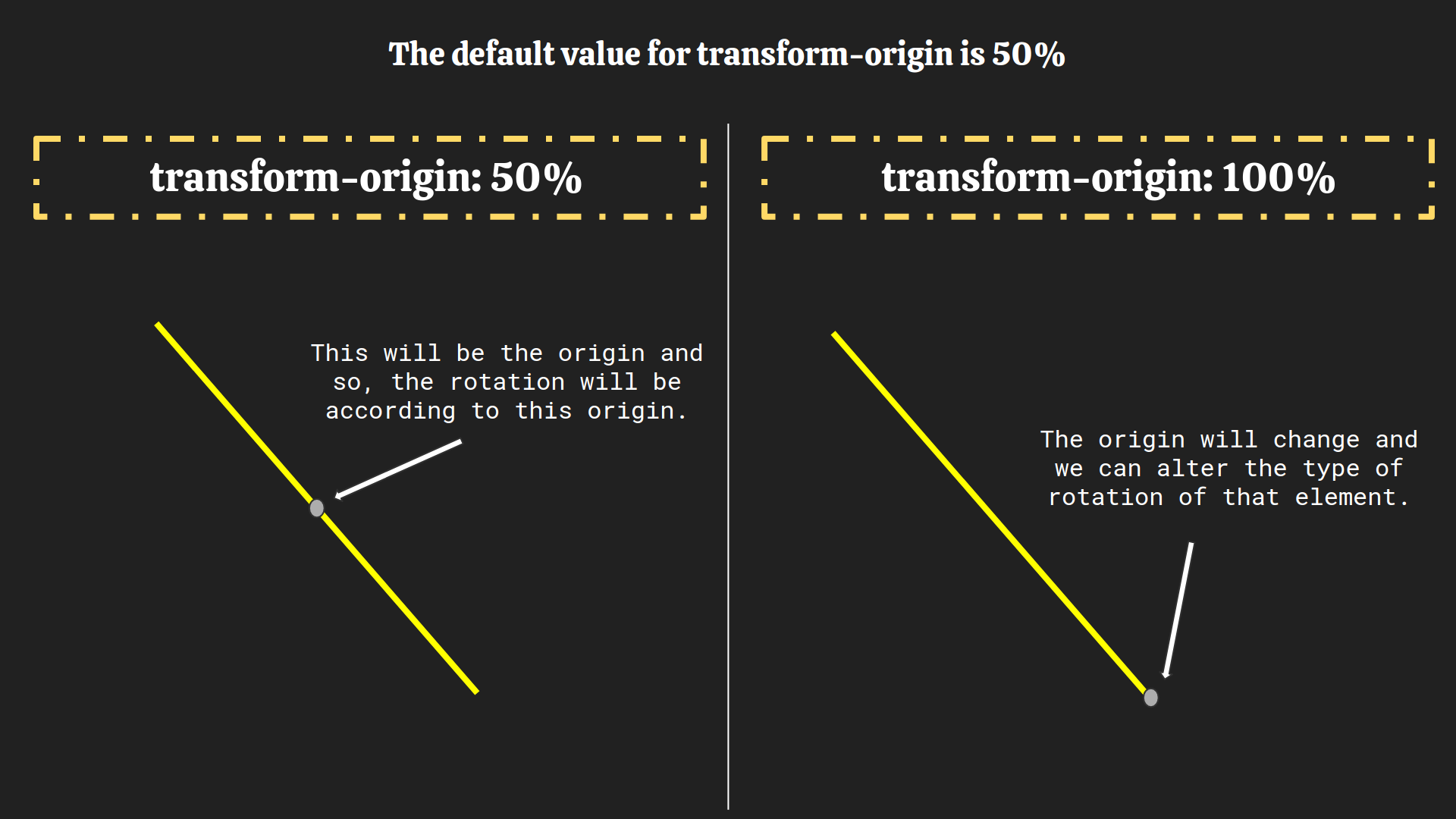
.hand {
  background: black;
  height: 6px;
  position: absolute;
  top: 50%;
  transform-origin: 100%;
  transform: rotate(90deg);
  transition: all 0.05s;
  transition-timing-function: cubic-bezier(0.1, 2.7, 0.58, 1);
}

.hour-hand {
  width: 30%;
  right: 50%;
}

.min-hand {
  width: 35%;
  right: 50%;
}

.second-hand {
  width: 40%;
  right: 50%;
}
Explanation: We give the clock hands a black color. We specify the clock hands' height and position.
Next, we give it a property of top to 50%, basically it aligns the clock hands in the very center of our clock. To ensure that our clock rotates properly, we give the clock hands a transform-origin: 100%;. The transformation origin is the point around which a transformation is applied.
Next we added more transition properties such as:
transition: all 0.05s;
transition-timing-function: cubic-bezier(0.1, 2.7, 0.58, 1);
The transition: all 0.05s; property sets a 0.05s animation duration. The transition-timing-function: cubic-bezier(0.1, 2.7, 0.58, 1); property is just a transition effect applied to the clock!
Learn more about transform-origin.
Learn more about cubic-bezier.
Note: The .hand class was given to 3 <div> tags which means this styling will affect all the 3 <div> tags. To give some extra classes to the hour hand, minute hand, and the second hand specifically, we also gave those 3 <div> tags a unique class name.
To align each hand properly, we give them a property of right: 50%;.
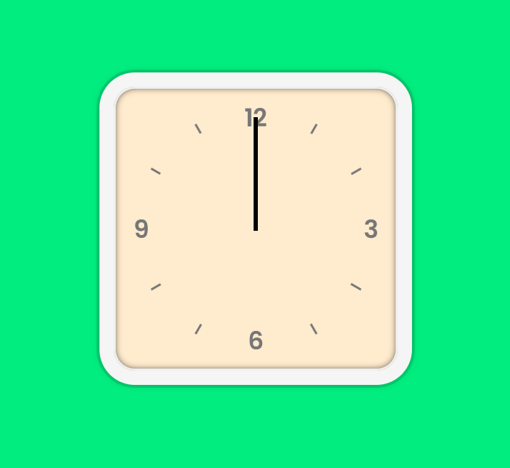
Here's what we have so far:
What we did so far:
- We built the structure of the clock with HTML.
- We built the display of the clock with CSS.
- Now with JavaScript, we will build the functionality of the clock.

3) JavaScript
So far, we have the clock hands aligned correctly and now in this section, we will animate them. Before panicking, let me ensure you that there are just 30 lines of JavaScript code!
Go to your script.js file. First let's link the <div> tags in our HTML to JavaScript. Type the following code:
const secondHand = document.querySelector('.second-hand')
const minHand = document.querySelector('.min-hand')
const hourHand = document.querySelector('.hour-hand')
Explanation:
We declare the variables secondHand, minHand, hourHand using const and set their value to the first element that matches a specified CSS class(s) in the document. In our case, that CSS selectors are .second-hand , .min-hand , .hour-hand respectively.
What is querySelector()? The querySelector() method returns the first element that matches a specified CSS class(s) in the document.
Learn more about query selector.
Now it's time to implement a function for the proper functionality of the clock. Create a function setDate at the bottom of your file.
function setDate() {}
We can get the current date using the JavaScript Date object. Let's store it in a variable:
function setDate() {
  const currentTime = new Date()
}
The Date object contains specific methods through which we can get the current hour / minute / second.
Learn more on JavaScript dates.
Let's start by getting the current seconds, Add this code to the setDate function:
const seconds = currentTime.getSeconds()
Now, if we want the hands to rotate, we can't simply feed the current time to it. We'll need to convert the current values into degrees and then do the transition. Time to do some maths!

Code:
function setDate() {
  const currentTime = new Date()
  const seconds = currentTime.getSeconds()
  const secondDeg = (seconds / 60) * 360 + 90
  secondHand.style.transform = `rotate(${secondDeg}deg)`
}
Explanation:
We have the current seconds between 1 - 60 stored in the seconds variable. We then create a new variable (secondDeg) in which we use an equation to convert the current seconds into degrees. In the next line, we add the transform style property to the secondHand which will rotate the hand according to the value of secondDeg.
Note: Here, we used backticks (``) instead of quotes (" "). This is an ES6 syntax. It helps us to write variables inside of strings.
So that line basically looks like:
eg: if secondDeg = 150;
then: secondHand.style.transform = 'rotate(150deg)';
Challenge: Do the same above process for fetching the minutes & hours and convert them into degrees.
Hint: Use the methods getMinutes() and getHours().
The code so far:
function setDate() {
  const currentTime = new Date()

  const seconds = currentTime.getSeconds()
  const secondDeg = (seconds / 60) * 360 + 90
  secondHand.style.transform = `rotate(${secondDeg}deg)`

  const mins = currentTime.getMinutes()
  const minsDeg = (mins / 60) * 360 + 90
  minHand.style.transform = `rotate(${minsDeg}deg)`

  const hours = currentTime.getHours()
  const hoursDeg = (hours / 12) * 360 + 90
  hourHand.style.transform = `rotate(${hoursDeg}deg)`
}
Our clock is almost finished! We now just need to call that function repeatedly.
This is going to be a bit complex task, so let's do it step by step.
- Call a
requestAnimationFrame()function inside of our main functionsetDate().
function setDate() {
... // all the previous code
requestAnimationFrame();
}
- Pass
setDatetorequestAnimationFrame().
function setDate() {
... // all the previous code
requestAnimationFrame(setDate);
}
- Call the function
setDate()at the very end of our JavaScript file.
What is requestAnimationFrame()? There used to be just one way to do a timed loop in JavaScript which was setInterval(). For the purpose of animation to appear smooth, (sixty frames per second) requestAnimationFrame() was introduced.
Benefits of using requestAnimationFrame():
- The browser can optimize it, so animations will be smoother.
- Animations in inactive tabs will stop, allowing the CPU to chill.
- More battery-friendly.
Learn more on requestAnimationFrame().
Let us now try to run our code. And Voila! Our clock is ready!
Our code so far:
const secondHand = document.querySelector('.second-hand')
const minHand = document.querySelector('.min-hand')
const hourHand = document.querySelector('.hour-hand')

function setDate() {
  const currentTime = new Date()

  const seconds = currentTime.getSeconds()
  const secondDeg = (seconds / 60) * 360 + 90
  secondHand.style.transform = `rotate(${secondDeg}deg)`

  const mins = currentTime.getMinutes()
  const minsDeg = (mins / 60) * 360 + 90
  minHand.style.transform = `rotate(${minsDeg}deg)`

  const hours = currentTime.getHours()
  const hoursDeg = (hours / 12) * 360 + 90
  hourHand.style.transform = `rotate(${hoursDeg}deg)`

  requestAnimationFrame(setDate)
}

setDate()
But let's wait for a minute to pass and see if its working correctly. Did you see a glitch which just happened for a millisecond? Let's fix it by adding this code inside our function before the requestAnimationFrame(setDate):
if (seconds == 0) {
  secondHand.style.transitionDuration = '0s'
  minHand.style.transitionDuration = '0s'
  hourHand.style.transitionDuration = '0s'
} else {
  secondHand.style.transitionDuration = '0.05s'
  minHand.style.transitionDuration = '0.05s'
  hourHand.style.transitionDuration = '0.05s'
}
Explanation :
Remember this code snippet which we wrote in our CSS file?
.hand {
... // all the above code
  transition: all 0.05s; /* check near line 38. */
}
It specified the transition duration of 0.05s for the clock hands. Now to fix that bug, we'll remove this duration when the second-hand completes a minute.
Step by step explanation:
-
We use
if-elsestatements to check if our current seconds are 0, i.e we check if we passed a minute. -
When that statement is true, i.e when we pass a minute, we set the
transitionDurationof all the clock hands to 0. -
When that statement is not true, we keep all our
transitionDurationto the normal value (0.05s). -
This will prevent that bug from happening every minute.
The Final Code:
const secondHand = document.querySelector('.second-hand')
const minsHand = document.querySelector('.min-hand')
const hourHand = document.querySelector('.hour-hand')

function setDate() {
  const currentTime = new Date()

  const seconds = currentTime.getSeconds()
  const secondDeg = (seconds / 60) * 360 + 90
  secondHand.style.transform = `rotate(${secondDeg}deg)`

  const mins = currentTime.getMinutes()
  const minsDeg = (mins / 60) * 360 + 90
  minsHand.style.transform = `rotate(${minsDeg}deg)`

  const hours = currentTime.getHours()
  const hoursDeg = (hours / 12) * 360 + 90
  hourHand.style.transform = `rotate(${hoursDeg}deg)`

  if (seconds == 0) {
    secondHand.style.transitionDuration = '0s'
    minsHand.style.transitionDuration = '0s'
    hourHand.style.transitionDuration = '0s'
  } else {
    secondHand.style.transitionDuration = '0.05s'
    minsHand.style.transitionDuration = '0.05s'
    hourHand.style.transitionDuration = '0.05s'
  }

  requestAnimationFrame(setDate)
}
setDate()
And congratulations! You just built a clock using nearly 30 lines of JavaScript!

Part 5: The End
If you haven't created an account on repl.it, make sure you do so to save this wonderful piece of creation!
Here's how you can create a repl.it account:
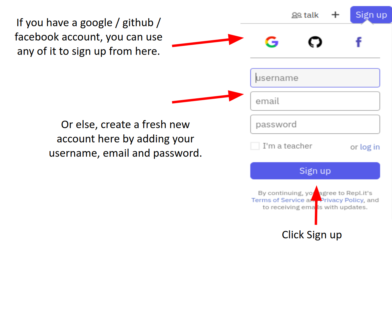
If you still face difficulties in signing up watch this.
Here are some things which you can do:
- Consider changing the colors and adding more features!
- Try to make the clock circular!
- Try to make it have a dark theme!
- Try to think of more unique ideas on how you can add more features (displaying the date etc).
Examples on how people have customized it:
Now that you have finished building this wonderful clock, you should share your beautiful creation with other people! Remember, it's as easy as giving them your URL!
You probably know the best ways to get in touch with your friends and family, but if you want to share your project with the worldwide Hack Club community there is no better place to do that than on Slack.
- In a new tab, open and follow these directions to signup for our Slack.
- Then, post the link to the
#scrapbookchannel to share it with everyone!